Soda Pop
packaging design
2025
packaging design
2025
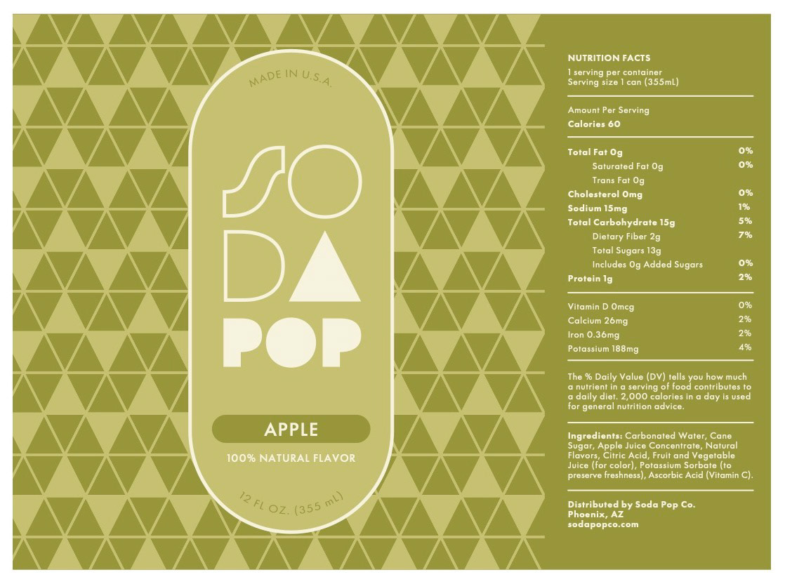
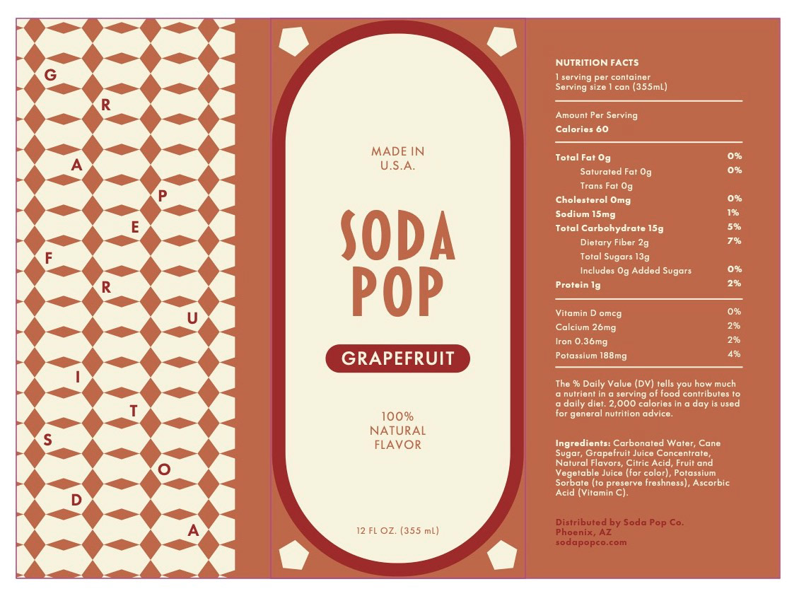
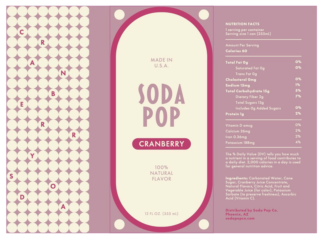
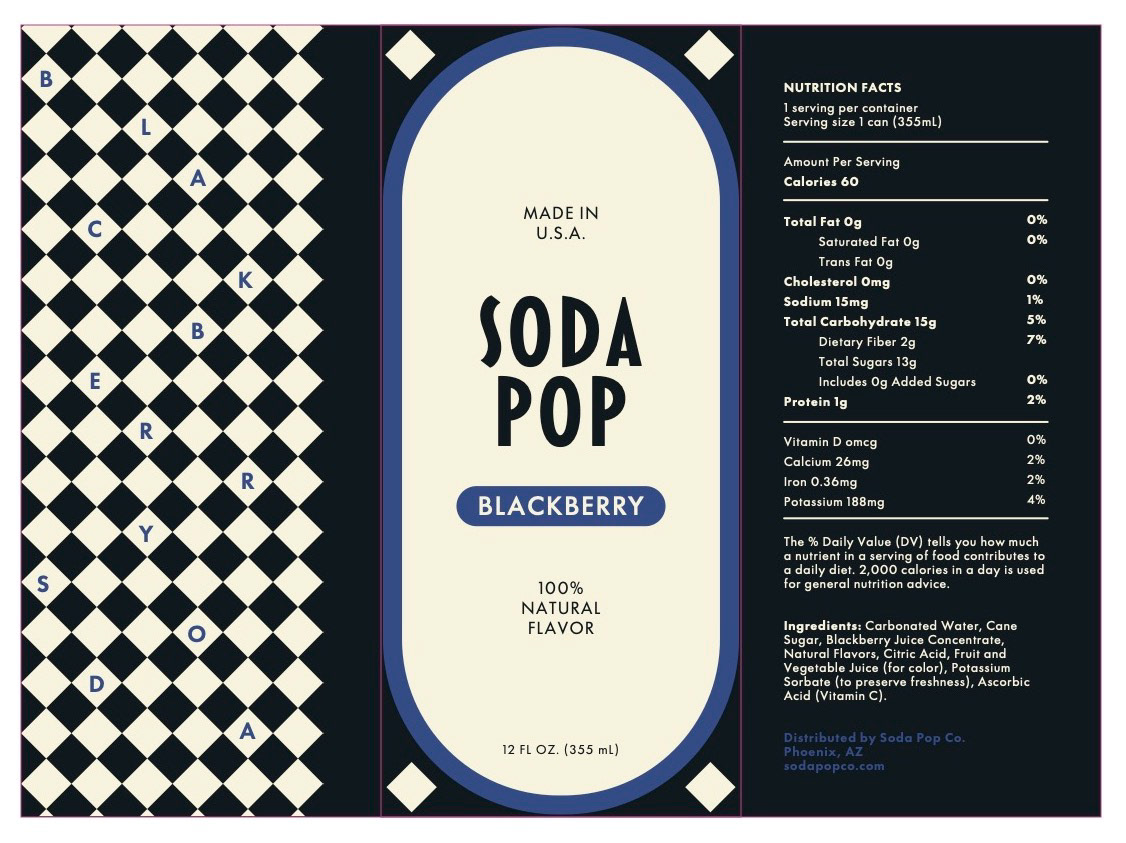
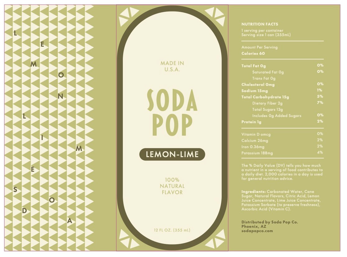
Soda Pop is inspired by the Art Deco movement, focusing on geometrical forms, symmetrical patterns, and bold colors.
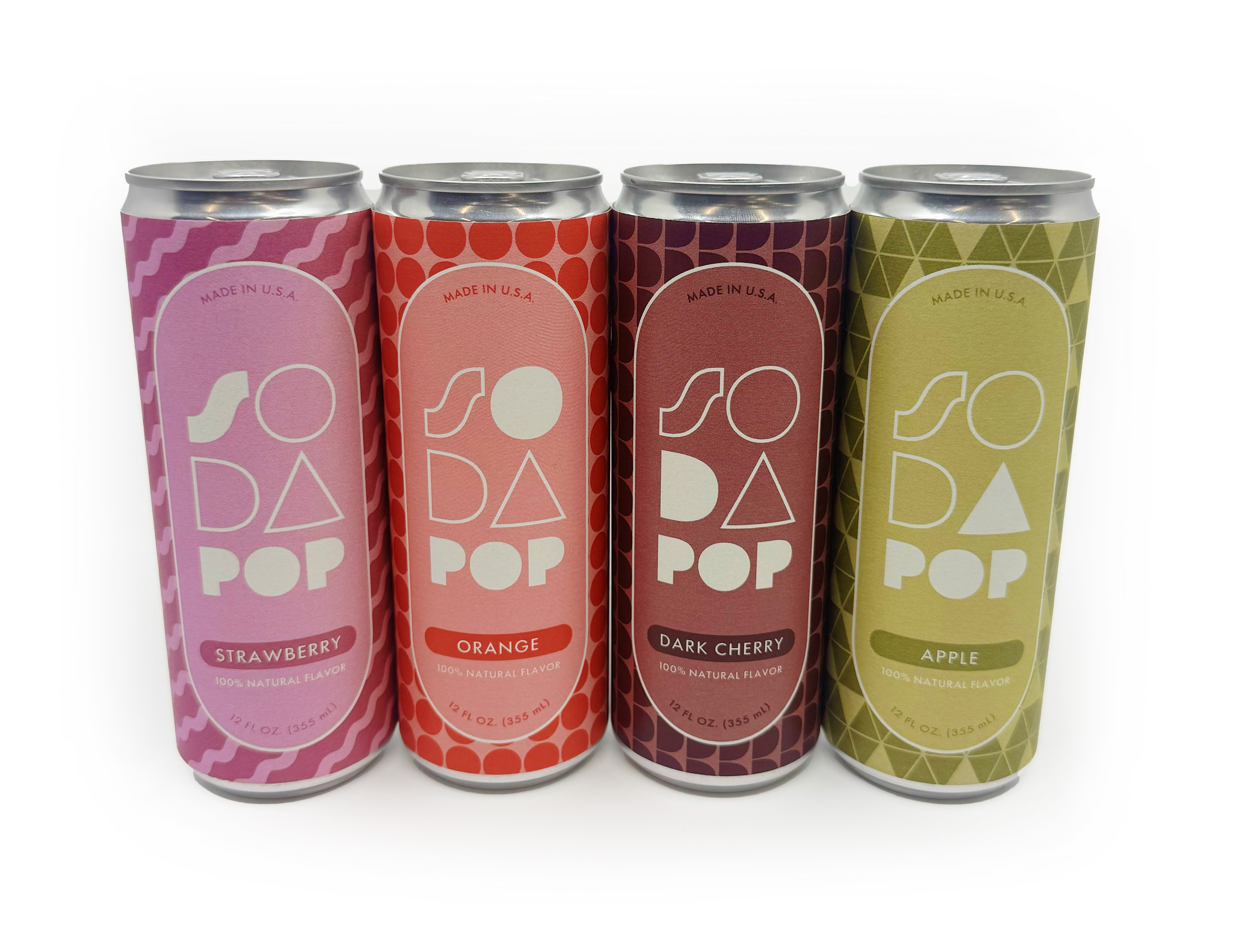
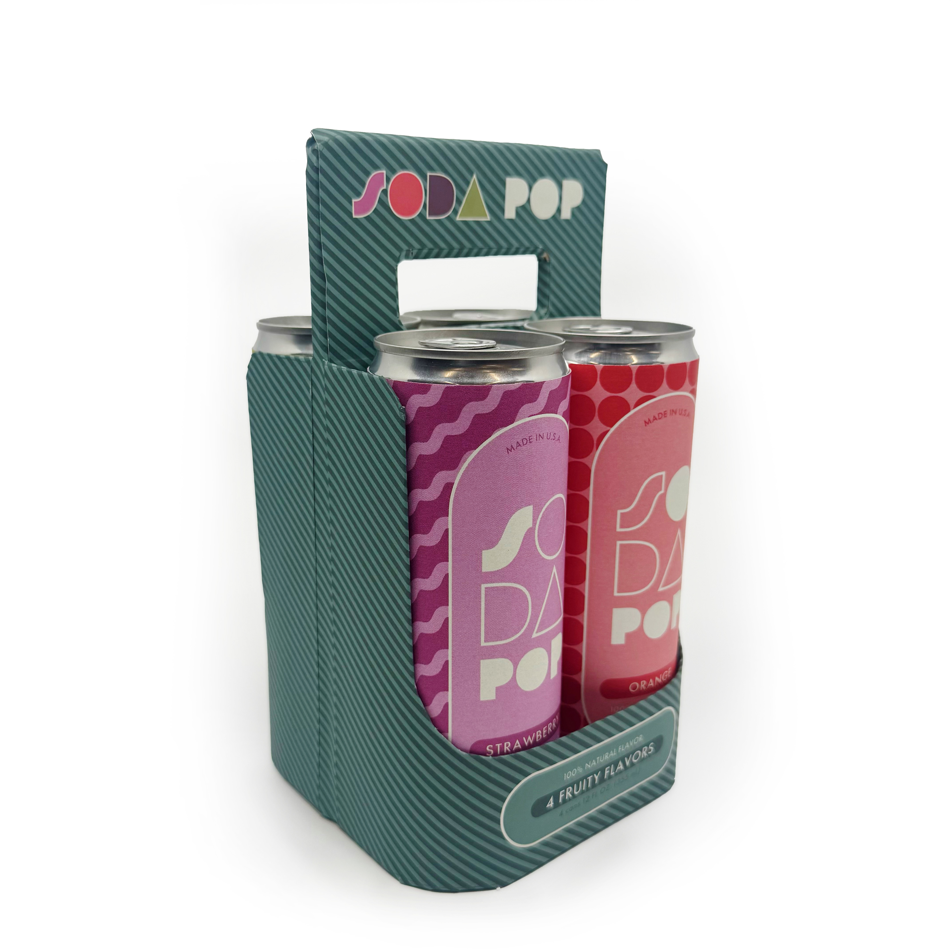
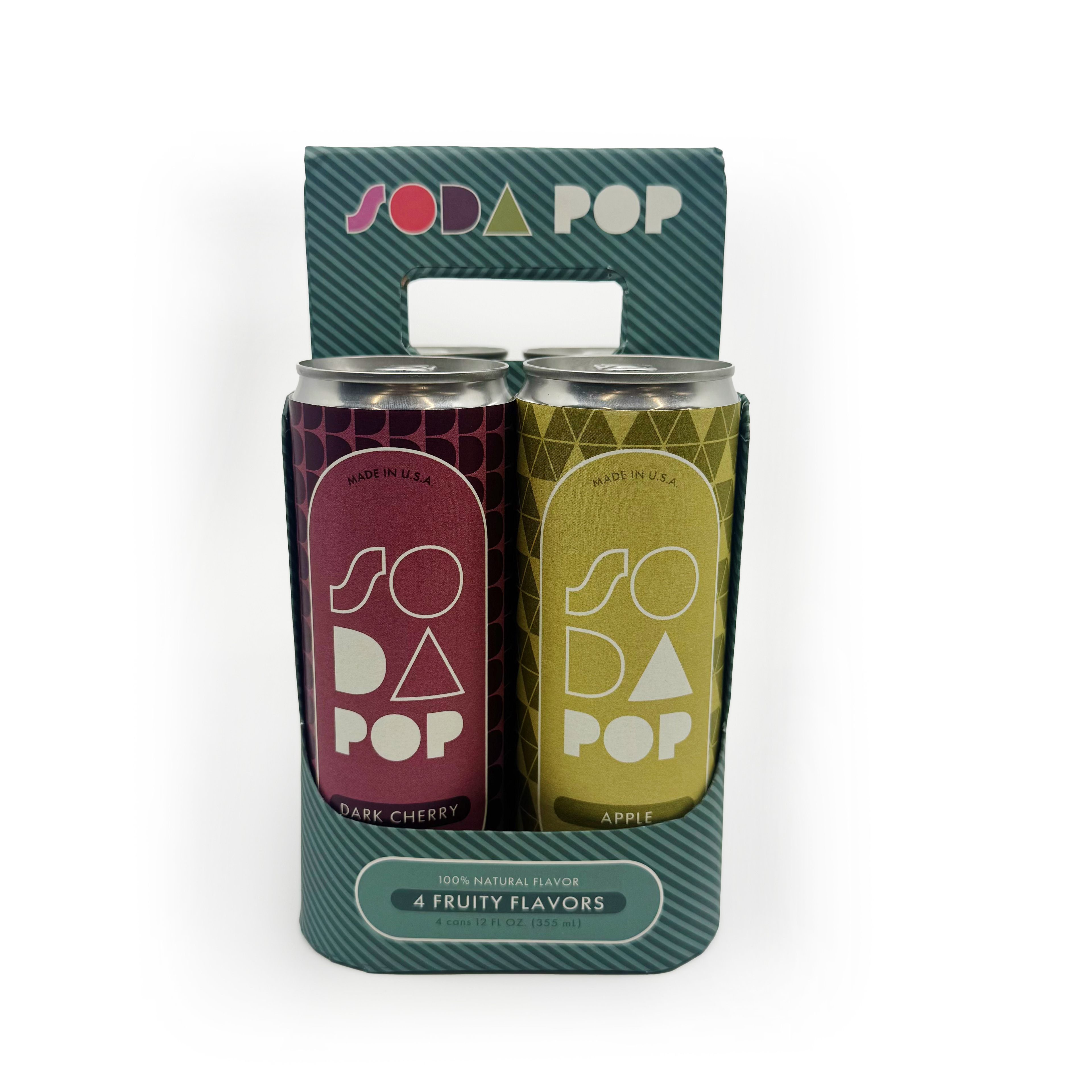
Process: After researching the Art Deco movement, I knew I wanted to incorporate bold sans serif typefaces, with fun patterns and colors to add my own twist. From the first draft, I realized I needed to be more intentional, so I chose a more stable typeface, created flavors beginning with each letter of SODA, and designed patterns using the corresponding letters.
Draft 1 – What I started with
Draft 1 – What I started with
Draft 1 – What I started with
Draft 1 – What I started with
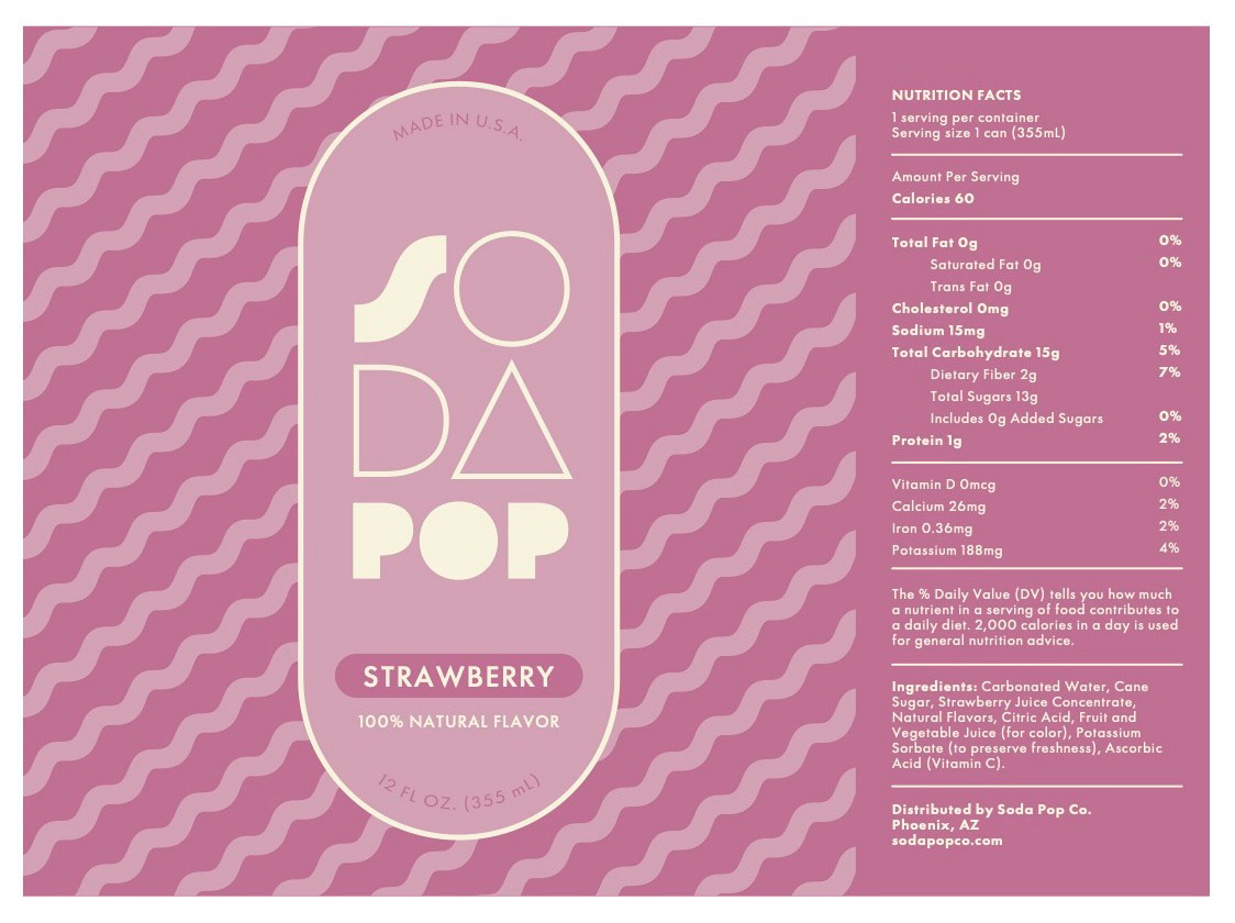
Final Product
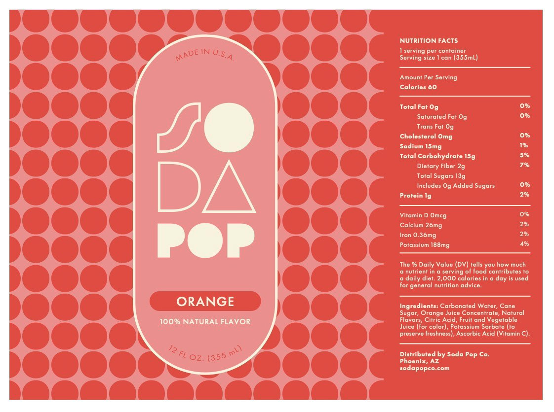
Final Product
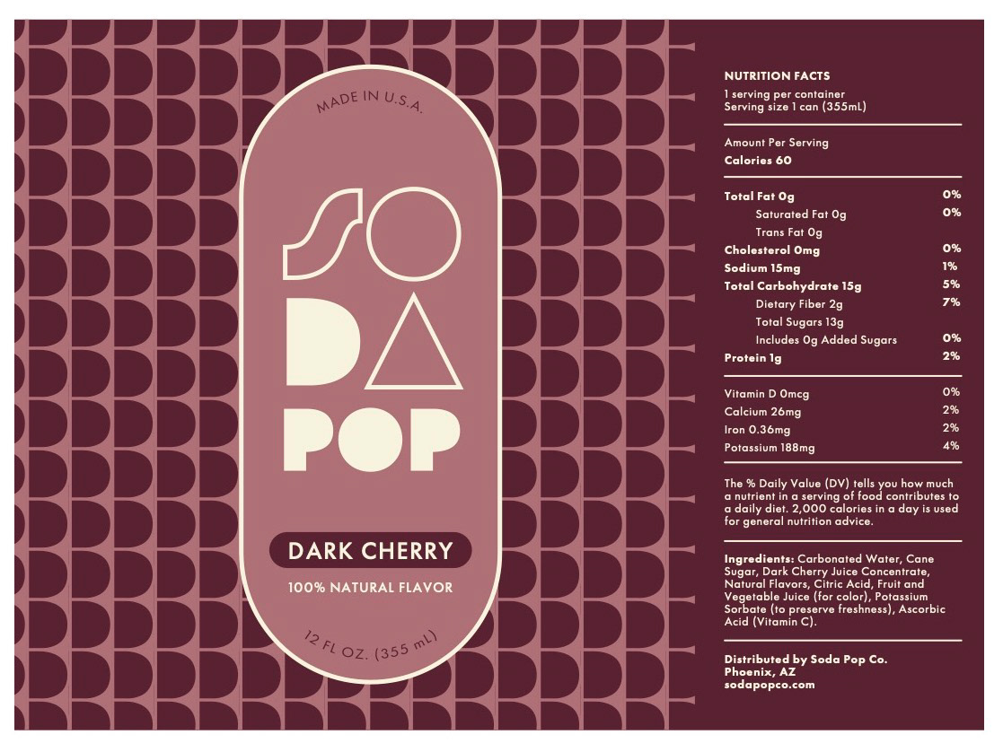
Final Product