Little Women
packaging design
2025
packaging design
2025
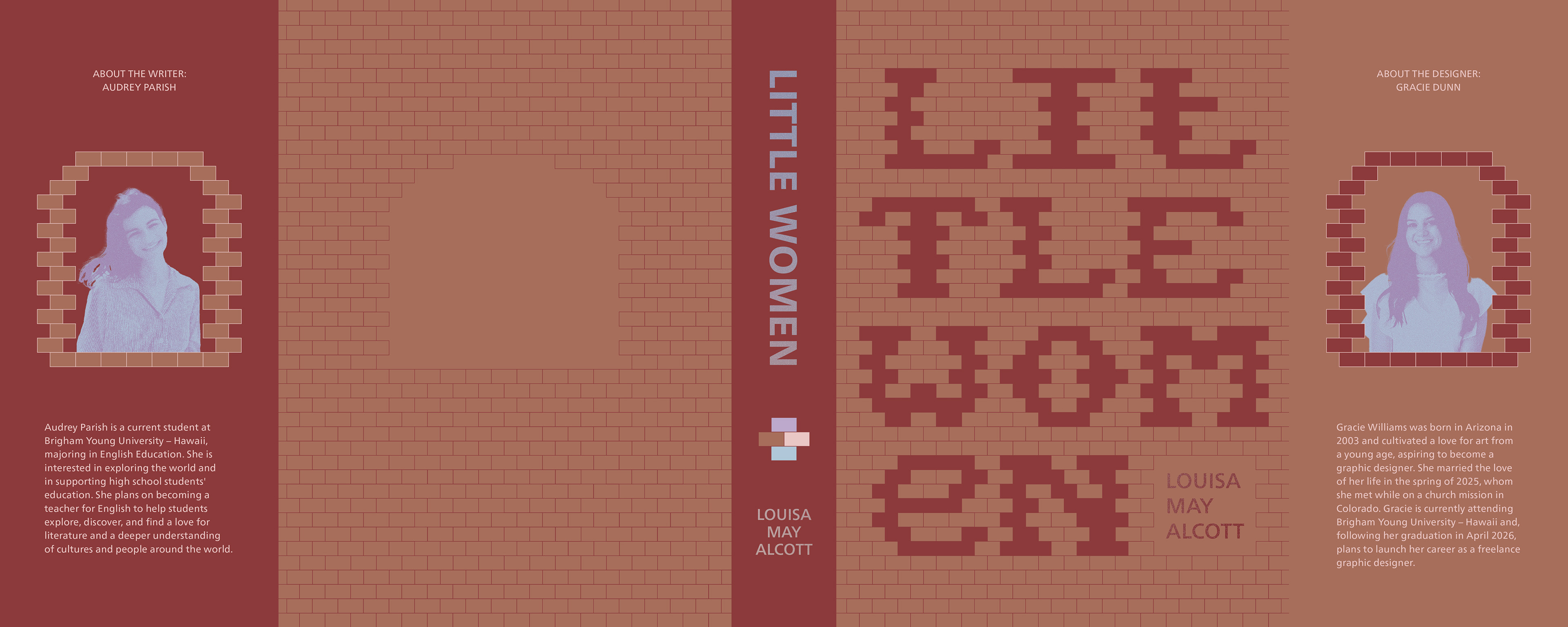
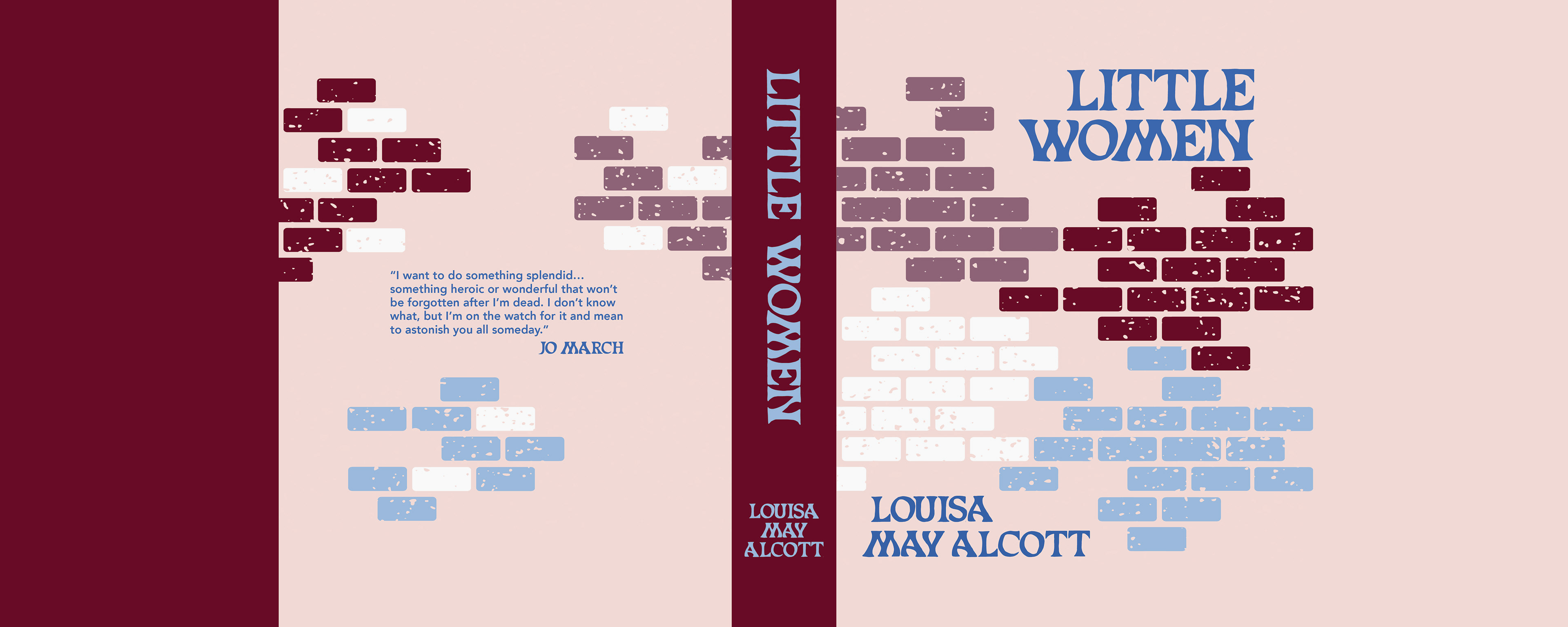
This redesign of the classic novel Little Women, highlights the setting of the book inside the walls of the March girls’ home. The cutout letters nod to peering inside their lives and discovering who they are as strong individuals.
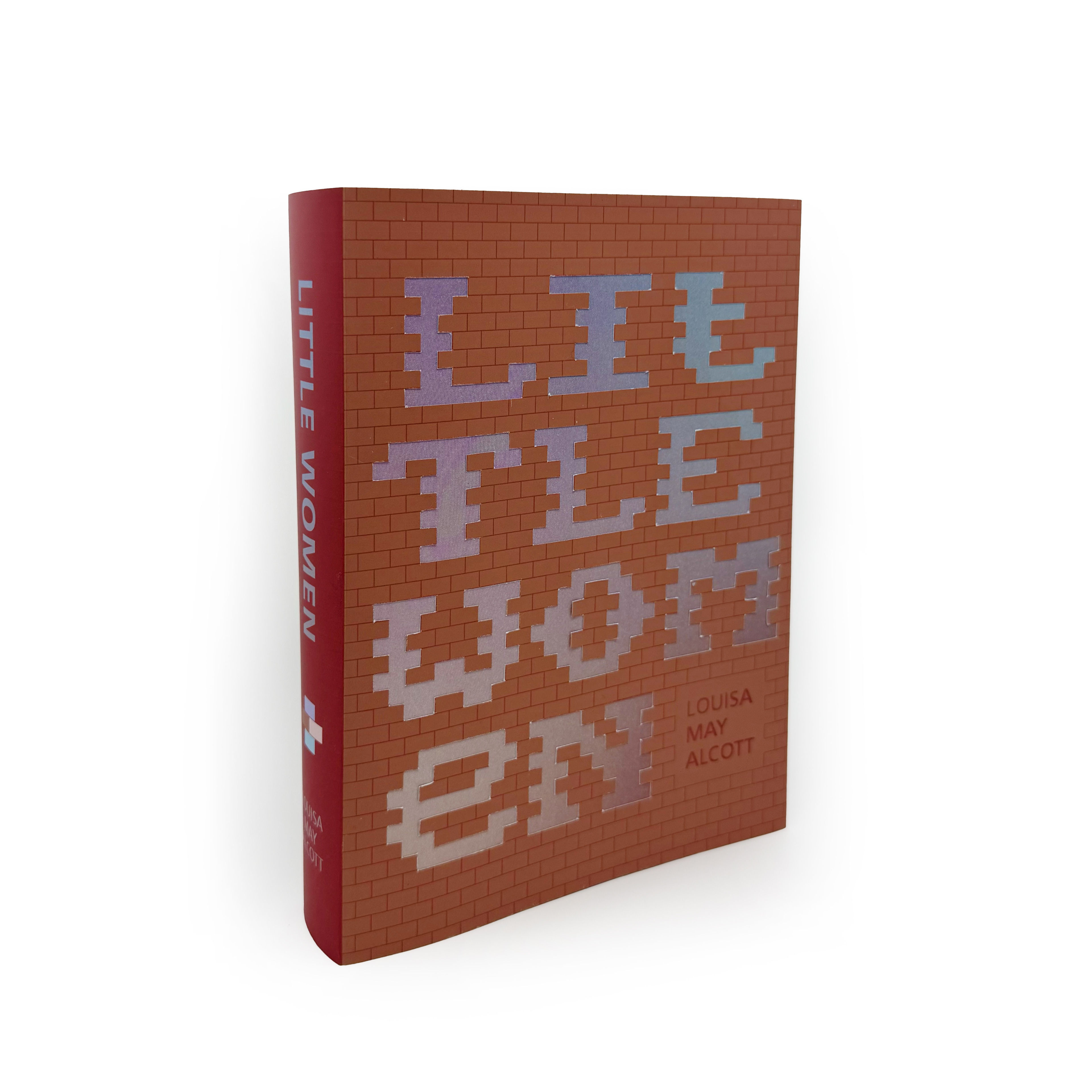
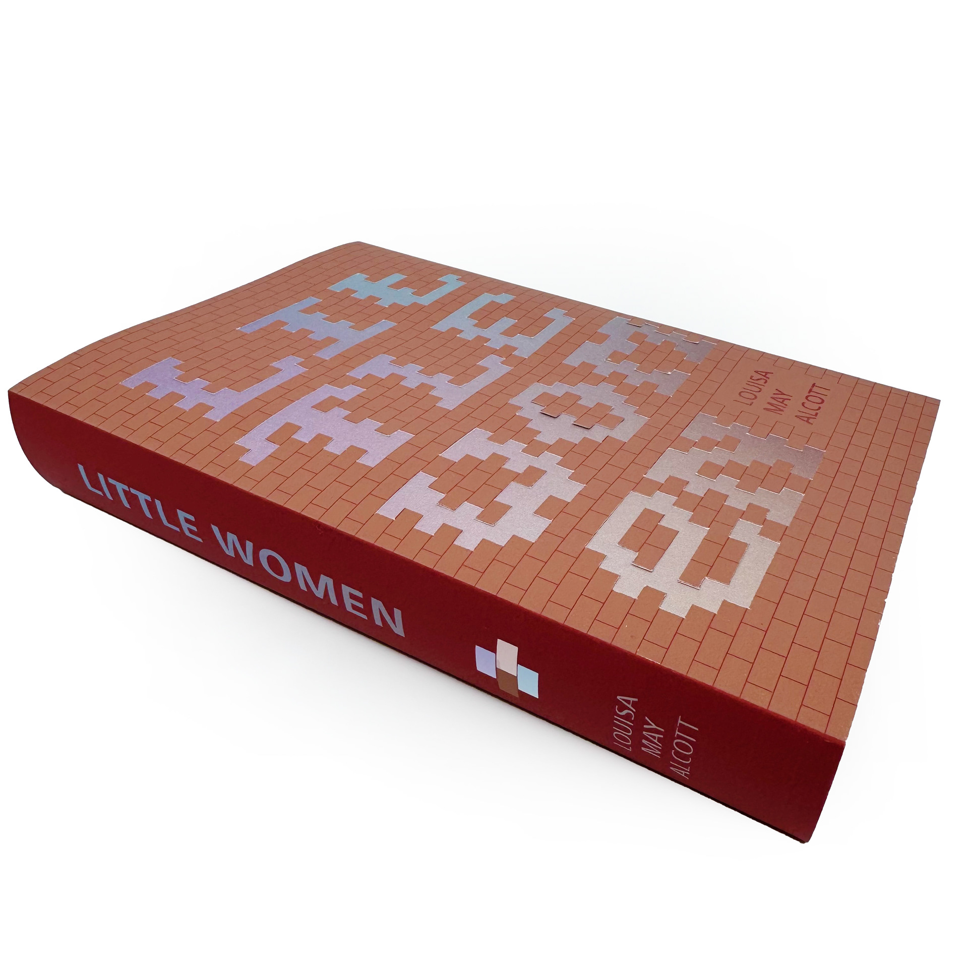
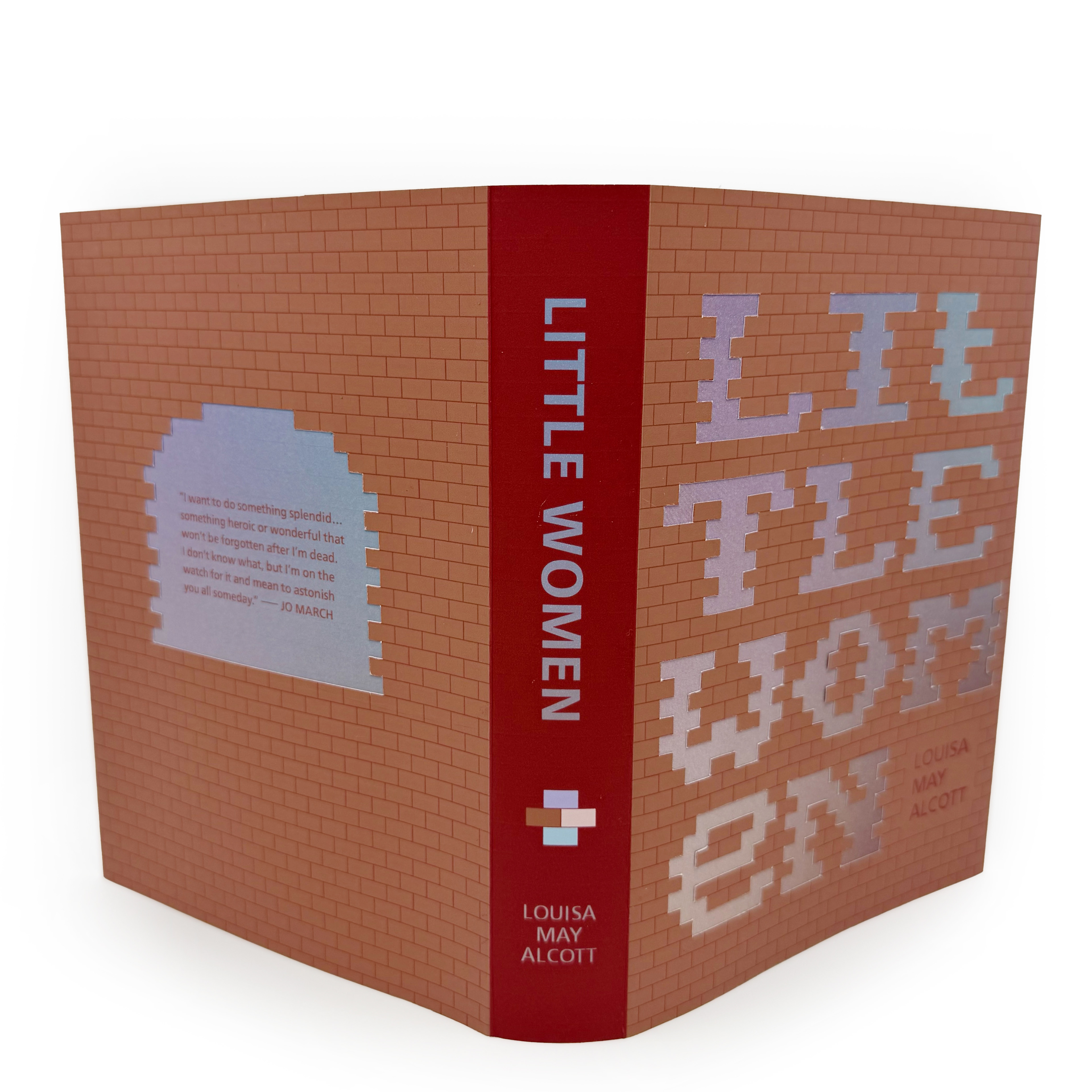
Process: I wanted to think abstractly when redesigning the Little Women book cover to avoid what has been done before. Bricks are symbolic of the setting, but also the strength and support the sisters lend to one another. This concept developed a lot from the beginning, specifically in the added depth and texture the background of bricks provides.
Draft 1 – What I started with